Joy in Every Hue: Shaping a Vibrant Design System
Casa Moderna
Brand Identity and Art Direction
Casa Moderna Expo, Mexico City's newest annual home improvement event, needed a bold identity to stand out in a market of visually similar competitors. Held at the Mexico City Convention Centre, this three-day event aims to inspire homeowners to embrace creativity and transform their spaces. Research revealed an opportunity for Casa Moderna to differentiate itself with a unique and exciting visual language.
Inspired by the work of renowned Mexican architect Luis Barragán, whose masterful use of bold colours and architectural forms is eye-catching, the expo's identity centres around the concept Form Meets Colour. This theme emphasises the harmonious relationship between structure and palette, where shapes and hues combine to create a distinctive visual narrative.
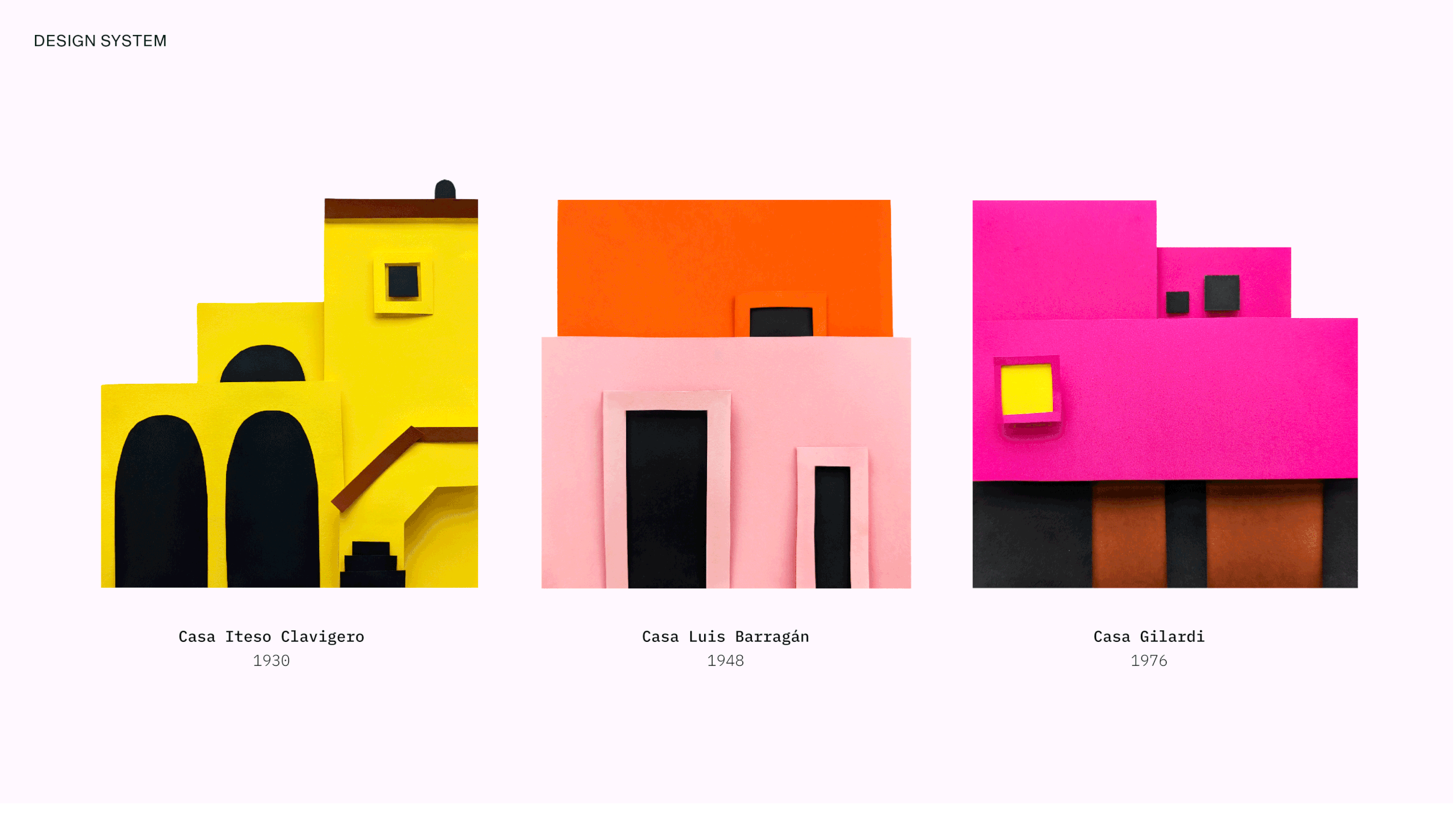
Reflecting the expo's "Do It Yourself" theme, three of Barragán's houses were physically recreated using paper, serving as the core inspiration for the entire design system. Image treatment, colour palette, typography and even a bespoke DIY type lockup were all derived from the forms and colours of these handcrafted models. The outcome was a vibrant and compelling design that excites potential attendees and encourages them to get creative with their home improvement projects.