Bare It All: Celebrating Confidence
with Charming Characters
Ome
Packaging Design • Illustration • Web Design • Animation
Ome is a skincare brand specialising in organic, luxurious soaps designed to nourish both body and mind. The brand aims to create memorable and luxurious products that resonate with younger women, with packaging that evokes positive feelings and boasts a punchy, attractive aesthetic.
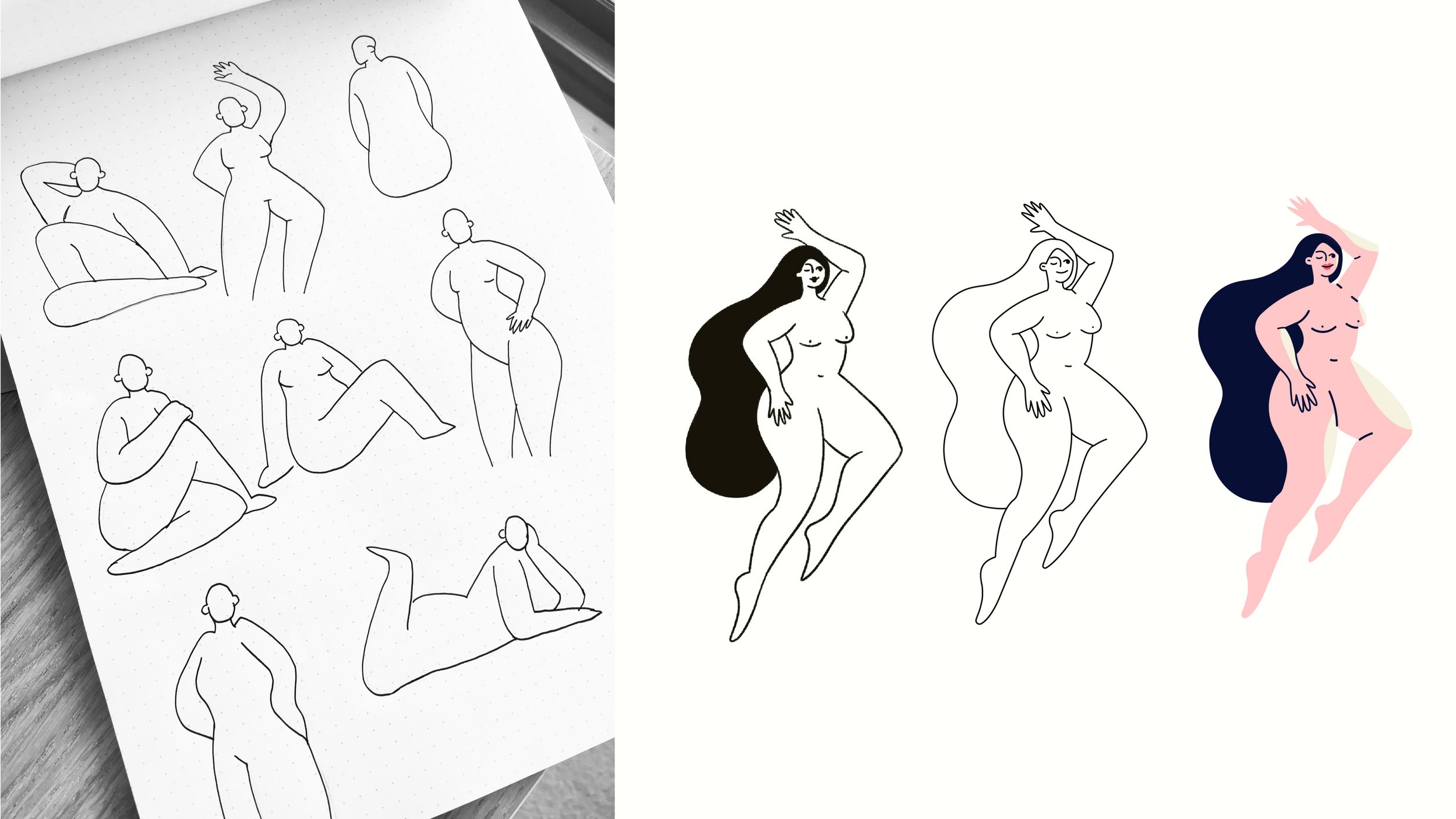
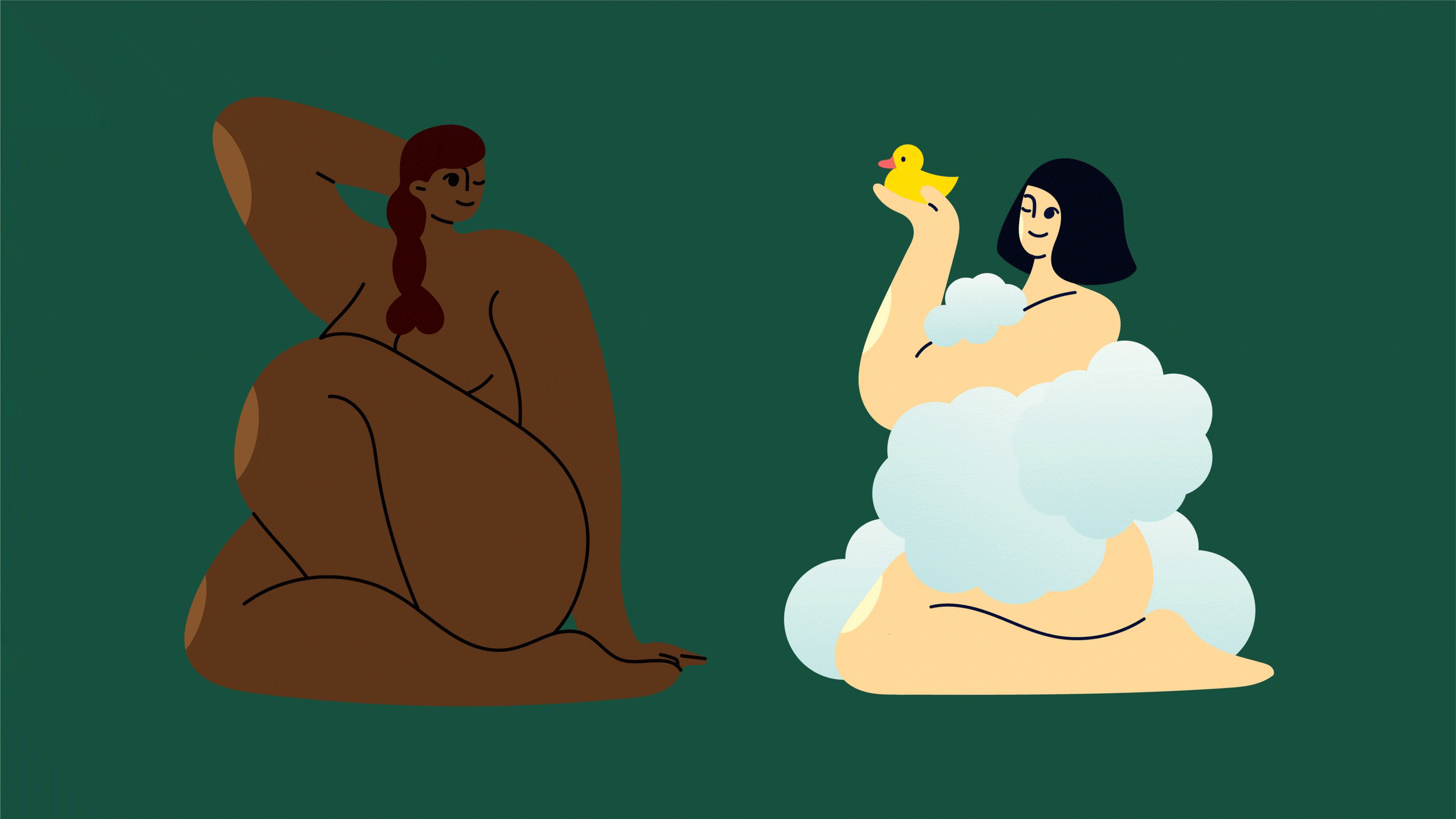
Inspired by life drawing and the appreciation of the human form, the visual identity features fun, illustrative characters that exude charm and confidence, celebrating self-love and body positivity. The name "Ome," derived from "Geometry," was chosen for its catchy, short and memorable quality. The soft sounds and rounded letterforms of O, M and E contribute to a playful and approachable feel.
The brand's strong tone of voice reinforces the joyful message of self-love, aiming to empower customers and communicate that confidence is queen. This distinctive visual identity not only sets Ome's soaps apart but also delivers a fun and empowering message.